Tag Archives: #bookcoverdesign

Creating a Novel Series Cover Brand

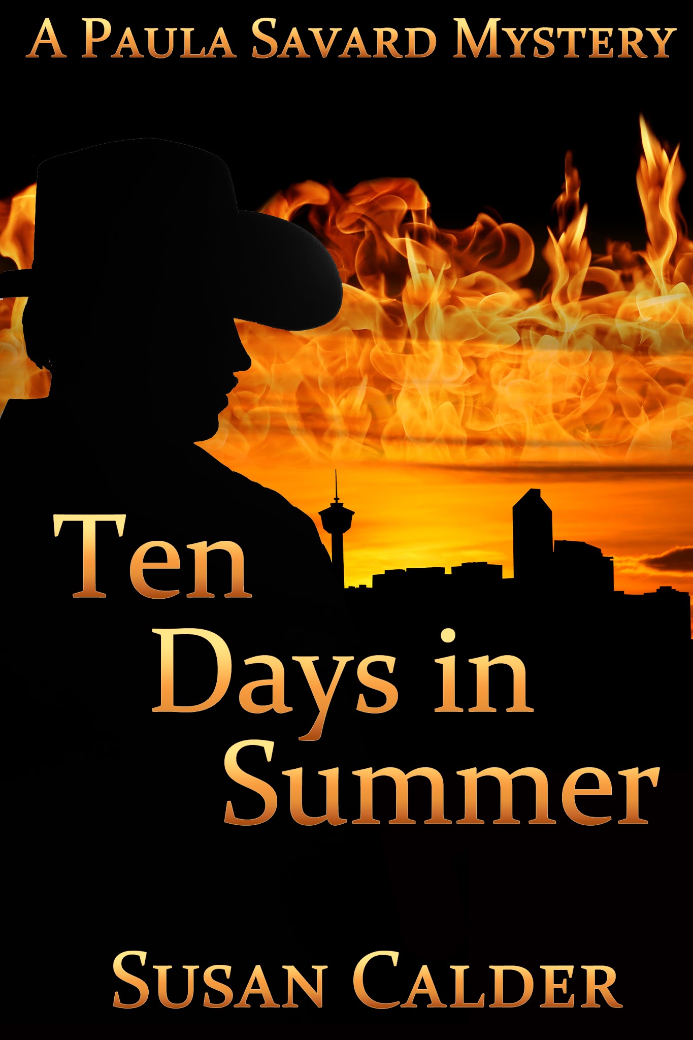
BWL’s Art Director didn’t set out to create a cover brand for my Paula Savard Mystery Series. The first cover that Michelle Lee designed for me was for book # 2 of my series, Ten Days in Summer, published in 2017. The process began with me filling out a BWL Cover Art Form (CAF). I provided details about the story, its setting in Calgary, and the two main characters and suggested images related to these. At that time, BWL required that most novel covers include at least one image of a person. 


I plugged keywords into the photo image website, searching for ones that suited my protagonist and the story antagonist, a wannabe cowboy. None were exactly right, especially for Paula, my insurance adjuster sleuth. “Female detective” turned up images of young women peering through magnifying glasses. Paula is fifty-two and doesn’t use that prop. Keywords “female insurance adjuster” showed women examining cars. The story involves a building fire insurance claim. I tried “businesswomen” and got images of women sitting in meetings, while Paula spends her time out on the case. 


I selected the best images for Paula that I could find along with images for my antagonist, which included a silhouetted cowboy.  I also suggested images of the Calgary skyline, fires, and a boarded-up house for the burned building. I don’t think Michelle used any of the exact images I sent, but she meshed my ideas into a cover that was better than one I could have designed (see cover image above). The fire suggests the heat of summer in the title. 


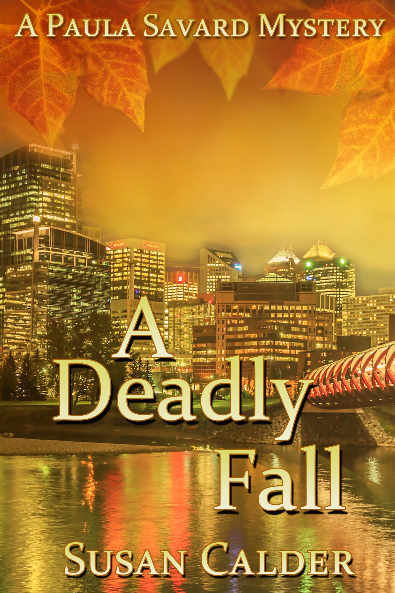
Two years later, BWL republished A Deadly Fall, book # 1 in the series. During that short time period, book cover fashion moved away from portraying people and toward crisp and intriguing images that evoke a sense of the story. Now BWL’s CAF stated that most covers would not include a person. I sent people image suggestions anyway, but I found it easier not to have to focus on finding an image that fit the characters in my head. On my CAF, I suggested images for the Calgary skyline and fall — fall leaves on water, a path in fall, trees with colourful fall leaves, and falling leaves. Again, I doubt Michelle chose my actual suggestions, but they were her starting point to create this golden cover.   

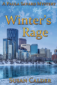
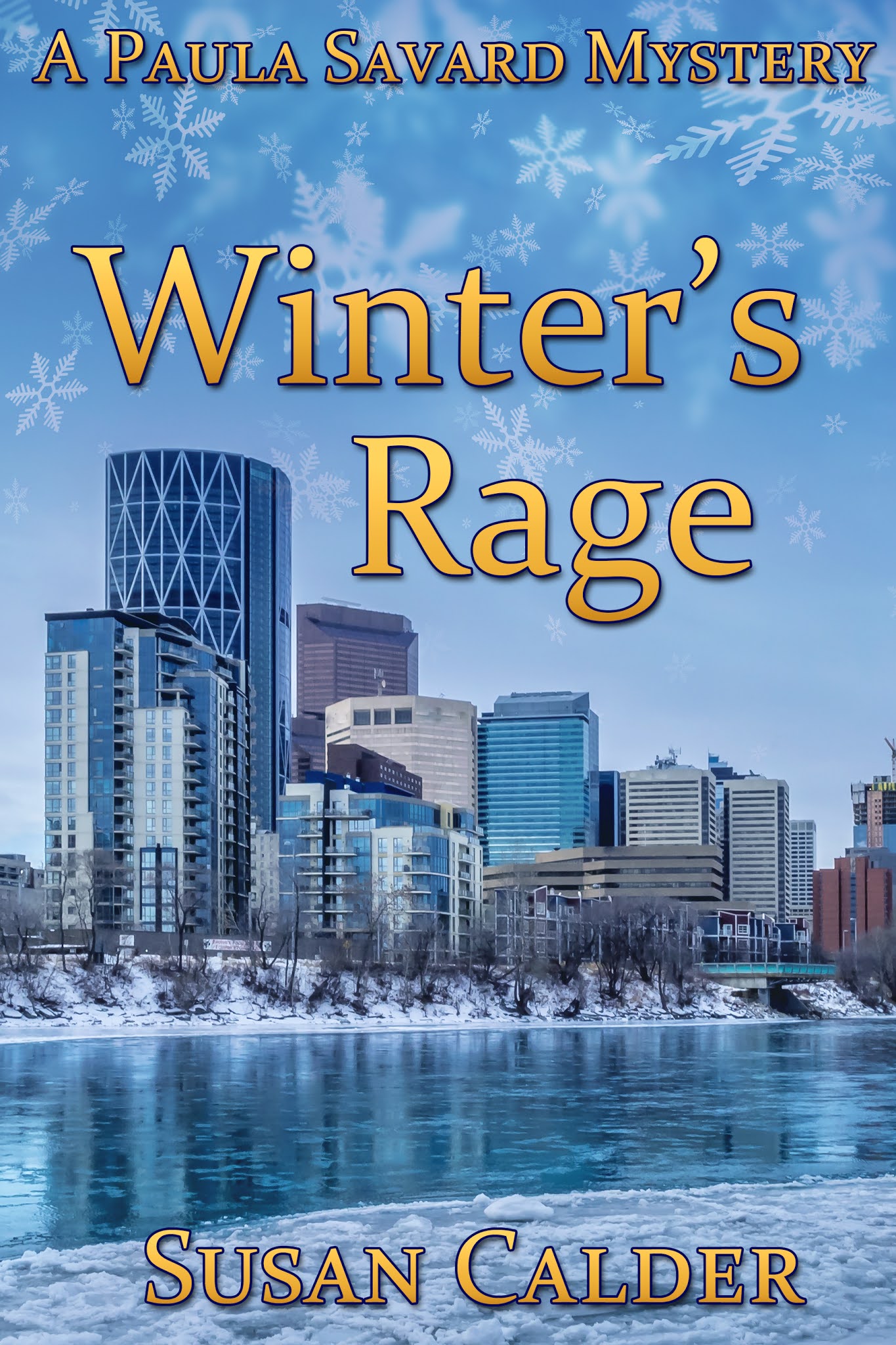
When the third series book, Winter’s Rage, was ready for a cover two years later, we were on our way to a series cover brand. My CAF included a few people image suggestions — a woman texting, a man in a snowstorm, but I focused on images of the Calgary skyline in winter and winter driving, since this story was about a hit-and-run collision.  For the first time I considered colour. While red, orange, and yellow suited the fall and summer seasons of the first two books, I saw winter as white, blue, and black (night). Michelle came up with a cover that continued the brand with snowflakes and a frozen Calgary. Winter’s book cover was blue, with yellow lettering that linked it to the colour of the two earlier books in the series.   

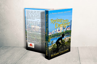
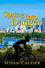
 By book # 4 of my Paula Savard Mystery Series, the series brand was established: Calgary skyline, colours to suit the story season, and additional images related to the season or story. Since bicycles feature prominently in Spring Into Danger, I included bicycle images among my CAF suggestions and chose Calgary skyline images that had a place for a bike or cyclist in the foreground. Here’s the cover design for Spring Into Danger, which is scheduled for release in September. 

 I like how the cyclist pops into view. Whenever I look at this cover, I don’t notice him until he emerges from the shadows. The book’s blue cover with yellow lettering matches Winter’s Rage and the covers for the four books have come full circle by including a silhouette on the first and last designI look forward to seeing Spring Into Danger sitting on a bookshelf.   


Every Cover Tells a Story

I like BWL’s process for designing book covers. It begins about six months before a book’s release, when we authors fill out a Cover Art Form. This includes factual information, such as the book title and author name to appear on the cover, a back cover book blurb, details about story, keywords for online searches and — my favourite part — ideas for cover images. After we submit the CAF, Art Director, Michelle Lee, designs our covers from purchased stock images. She combines and manipulates the images and adds background and other elements to create covers that hint at the story inside.  

I published my first BWL novel, Ten Days in Summer, in 2017.  At that time, the CAF stated that most of the covers would feature at least one person. When I searched for people images on the stock images website, I discovered a few problems. My main character, Paula Savard, is an insurance adjuster. A keyword search for her gender and job popped up images of women meeting with clients or examining construction sites and damaged cars. In this story, Paula investigates a building fire with a suspicious death. I searched ‘female detective’ and got pictures of young women holding guns and magnifying glasses. Paula was fifty-two. My search for professional women in their fifties unearthed a few possibilities, although none looked like my image of Paula.  

A basic problem with people images on novel covers is that writers and readers form their own images of fictional characters. I realized a full picture of Paula would interfere with reader engagement, although partial images still maintained enough mystery. This explained why rear-view images of women had become popular in novel cover art, but so common they were now considered cliché.  

For the CAF, I chose the best of the images I could find for Paula, plus female images shrouded in mystery — a woman’s legs in cowboy boots, eyes peering through a hole, and a silhouetted woman in a cowboy hat. Since the story backdrop is the Calgary Stampede and the second most prominent character is a self-styled cowboy, I added images of cowboys in silhouette, the Calgary skyline, and fire, for the incident that sets the story in motion. 

I sent the CAF to Michelle, who found images for the cowboy, fire and skyline that were different from the ones I’d suggested. She meshed them together to produce a cover better than any I could have dreamed up myself. 

Two years later, BWL reissued the first book in my Paula Savard mystery series. During this time, the trend in cover design moved away from people to symbolic images. Now the CAF stated that most BWL covers would not feature people unless we insisted. I searched for people images anyway, since I found this fun, but was glad to focus on images related to the story setting and mood. For the new cover of A Deadly Fall, I sent Michelle images of the Calgary skyline, falling leaves, fall trees, and pathways through fall woods. The murder takes place on a Calgary walking path. Michelle scored another hit with a cover design of leaves framing the Calgary skyline in glorious fall colours of gold, orange and yellow, along with the red of Calgary’s Peace Bridge. 

In February I completed my CAF for Winter’s Rage, book # 3 of the Paula Savard mystery series. This time, Paula investigates a hit-and-run collision that resulted in a woman’s death. Images of a tire on a snow-covered road, broken windshields, and car headlights in the dark would suit the story, but I wanted this cover to continue the series style. One problem. A Deadly Fall’s autumn time frame and Ten Days in Summer’s building fire resulted in covers with similar colours. Yellow, orange and red don’t evoke winter in Alberta. On the CAF, I suggested we bend the brand and go with white, blue or black winter shades. Michelle agreed. She created a scene of snow falling on a Calgary skyline draped in snow, the Bow River shining ice. Yellow letters echo the two earlier novels.  

The front cover of Winter’s Rage gives the first hint of the story. The back cover blurb reveals a little more https://bookswelove.net/calder-susan/ You can read what it’s all about this August.