BWL’s Art Director didn’t set out to create a cover brand for my Paula Savard Mystery Series. The first cover that Michelle Lee designed for me was for book # 2 of my series, Ten Days in Summer, published in 2017. The process began with me filling out a BWL Cover Art Form (CAF). I provided details about the story, its setting in Calgary, and the two main characters and suggested images related to these. At that time, BWL required that most novel covers include at least one image of a person.
I plugged keywords into the photo image website, searching for ones that suited my protagonist and the story antagonist, a wannabe cowboy. None were exactly right, especially for Paula, my insurance adjuster sleuth. “Female detective” turned up images of young women peering through magnifying glasses. Paula is fifty-two and doesn’t use that prop. Keywords “female insurance adjuster” showed women examining cars. The story involves a building fire insurance claim. I tried “businesswomen” and got images of women sitting in meetings, while Paula spends her time out on the case.
I selected the best images for Paula that I could find along with images for my antagonist, which included a silhouetted cowboy. I also suggested images of the Calgary skyline, fires, and a boarded-up house for the burned building. I don’t think Michelle used any of the exact images I sent, but she meshed my ideas into a cover that was better than one I could have designed (see cover image above). The fire suggests the heat of summer in the title.
Two years later, BWL republished A Deadly Fall, book # 1 in the series. During that short time period, book cover fashion moved away from portraying people and toward crisp and intriguing images that evoke a sense of the story. Now BWL’s CAF stated that most covers would not include a person. I sent people image suggestions anyway, but I found it easier not to have to focus on finding an image that fit the characters in my head. On my CAF, I suggested images for the Calgary skyline and fall — fall leaves on water, a path in fall, trees with colourful fall leaves, and falling leaves. Again, I doubt Michelle chose my actual suggestions, but they were her starting point to create this golden cover.

When the third series book, Winter’s Rage, was ready for a cover two years later, we were on our way to a series cover brand. My CAF included a few people image suggestions — a woman texting, a man in a snowstorm, but I focused on images of the Calgary skyline in winter and winter driving, since this story was about a hit-and-run collision. For the first time I considered colour. While red, orange, and yellow suited the fall and summer seasons of the first two books, I saw winter as white, blue, and black (night). Michelle came up with a cover that continued the brand with snowflakes and a frozen Calgary. Winter’s book cover was blue, with yellow lettering that linked it to the colour of the two earlier books in the series.

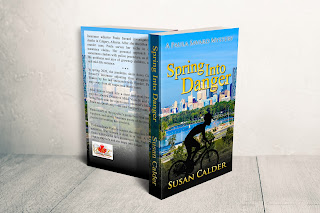
By book # 4 of my Paula Savard Mystery Series, the series brand was established: Calgary skyline, colours to suit the story season, and additional images related to the season or story. Since bicycles feature prominently in Spring Into Danger, I included bicycle images among my CAF suggestions and chose Calgary skyline images that had a place for a bike or cyclist in the foreground. Here’s the cover design for Spring Into Danger, which is scheduled for release in September.

I like how the cyclist pops into view. Whenever I look at this cover, I don’t notice him until he emerges from the shadows. The book’s blue cover with yellow lettering matches Winter’s Rage and the covers for the four books have come full circle by including a silhouette on the first and last design. I look forward to seeing Spring Into Danger sitting on a bookshelf.

